by Prof. Wenxian Zhang, Head of Archives & Special Collections
Branding is not a novel concept. To mark ownership, herdsmen practiced livestock branding for thousands of years. During ancient times, state officials, nobles, priests, legal professionals, and business people also used seals to authenticate documents in formal communication. In modern times, branding has been increasingly recognized as a very important tool in marketing and communication, and this has been the case at Rollins. Over the past 134 years, the College has had a colorful history in brand development. Logos have been used to enhance the image and prestige of the College, and this markedly contributed to the awareness of Rollins as a leading liberal arts institution in the scenic Sunshine State.
College Seal: From Sit Lux to Fiat Lux
Perhaps the most recognizable Rollins logo is the College seal. In the early days of human communication, in order to validate a document, a seal was often used to make an impression in wax, clay, or paper. That seal, either a graphic mark, emblem, or a symbol, later became a logo used to aid and promote public identification and recognition. However, when Rollins was first established in the late nineteenth century, brand awareness was not yet a top concern for the early leaders of the College. Founded as a coeducational institution of higher learning by the Congregational Church in 1885, Rollins became the first chartered college in Florida, at that time still a frontier state in the American South. During the early years of the College’s history, President Edward P. Hooker (1834-1904) and his colleagues were preoccupied with developing a rigorous classical curriculum, recruiting qualified faculty and students, building a new campus by Lake Virginia, and raising enough funds to keep the young institution financially afloat. It was not until the third administration, that of George Morgan Ward (1859-1930), that the original college seal was developed, which depicted a hand grasping a flaming torch with the Latin inscription Sit Lux (“Here is light”), first appearing in the 1894-95 Rollins College Catalogue.
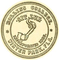
From its debut, however, members of the Rollins community did not embrace the symbol, considering it “too conventional.” In 1905, a new design was authorized, and the Board of Trustees finally adopted a new seal in 1908 that is still current today. Designed by Grace Lainhart, it bears Rollins’ now well-known motto, Fiat Lux (“Let there be light”).[1] Little is known about the final seal’s designer, Miss Grace Louise Lainhart (1874-1966), who was an instructor in the School of Domestic and Industrial Arts and the Director of the School of Fine Arts at Rollins from 1905 to 1908. According to the reflections of a former student: “As a teacher she was abrupt, impatient, sometimes almost rude, but equally appreciative of a lesson well prepared, an intelligent question or comment, a paper well written. Her most popular subject was brass hammering, and many excellent objects were turned out and exhibited by her pupils.”[2]
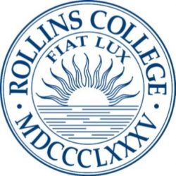
Lainhart’s design, depicting the image of the sun rising over the water is said to represent Lake Virginia with the sun, exemplifying the light of knowledge, rising to enlighten the lives of students. Hence the phrase Fiat Lux (“Let there be light”) became Rollins’ new motto and the rising sun over water the official seal, which is still used by the college today. According to the Rollins Brand Guidelines: “Use of the College’s official seal should be limited to formal college communications, diplomas, invitations, and ceremonial documents deemed appropriate. It may not be used as a graphic or secondary element without special permission of the Office of Marketing & Communications.”[3]
School Colors: From Oleander Pink to Rollins Blue & Gold
As a key element in logo design, color plays a powerful role in brand differentiation and success. The official colors of the College nowadays are known as “Rollins Blue and Gold.” This has not been the case from the beginning. Although Rollins was founded as a coeducational institution, the College always has had more female students than males. In fact, the first graduating class in 1890 consisted of all (two) female students. According to archival records, Elizabeth Hooker (1844-1912), wife of President Edward Hooker, was responsible for picking rose pink as the first school color for Rollins, chosen because oleanders “bloomed profusely at Commencement time” around the Horseshoe (the Green).[4]
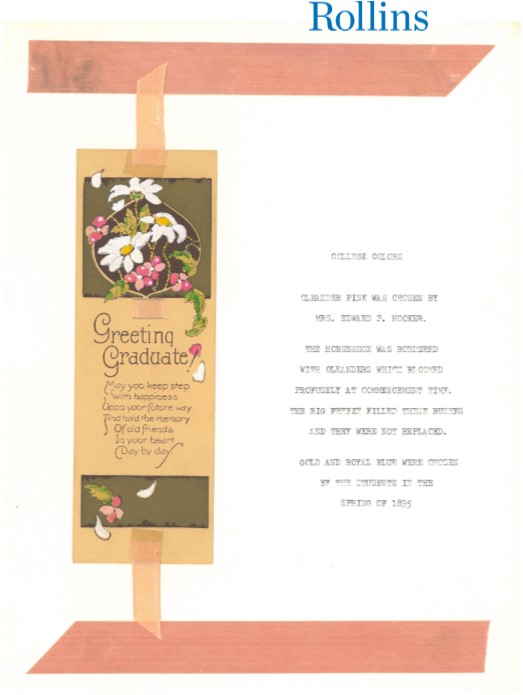
However, that color selection only lasted for five years. Since its introduction, Rollins students had voiced their opposition. An article in the first issue of The Sandspur noted: “The one strong objection to rose-pink is that it is felt to be inadequate to express dignity, strength and stability. It is a very pretty color for girls’ evening dresses, or worsted shoes and sacques for young babies, but we feel indeed that something with deeper meaning is demanded for the purpose under consideration.”[5] Instead of oleander pink, the newly formed Demosthenic Society (publishers of the student newspaper) actively lobbied for an alternative scheme: “A charming combination of colors are royal blue and gold, each color giving force to the other by contrast . . . Let the royal blue suggest kingship, power and the highest and deepest in character and aims, and let the gold mean to us, unchanging value and real, substantial worth.”[6]
After citing practical reasons and recruiting support from Rollins alumni, the Demosthenic Society voted unanimously for the new colors and appointed a committee to draw up a petition to submit to the faculty. Henry B. Mowbray ’97 (1872-1958), the first student editor of The Sandspur, became a vocal leader in this endeavor; he later confessed that he had personal motivations for generating support for the new colors, namely securing the affections of a fellow female classmate at the time.[7] In the end, his romantic quest failed miserably; but the students’ public campaign for the new color scheme turned out to be a huge success. On April 16, 1895, the faculty voted “to accept students’ choice for college colors – royal blue and gold.”[8]
Coat of Arms, College Ring, and Other School Symbols
Not too many people know that Rollins has a well-designed coat of arms. Traditionally, a coat of arms is a heraldic visual design on an escutcheon (shield), surcoat, or tabard, which is unique to an individual person, family, state, organization or corporation; and the images composed on coats of arms are in many cases designed to convey a feeling of power and strength, often in military terms. The coat of arms on an escutcheon forms the central element of the full heraldic achievement that typically consists of shield, supporters, crest, and motto. In the present day, coats of arms are still in use by a variety of institutions and individuals, and many European cities and well-established universities have guidelines on how their coats of arms may be used and judiciously protect their usage as trademarks.
It was President Hamilton Holt (1872-1951), classically trained at Yale, who commissioned the college’s first heraldic shield. Holt was a journalist by trade in his early career and therefore a media-savvy individual. After he became the eighth president of the College, Holt took the struggling institution and transformed it into a national leader in pragmatic liberal arts education. He was also credited as the mastermind behind the Spanish Mediterranean architecture of Rollins’ lovely and award-winning campus grounds, and he commissioned Ralph Adams Cram ’38H (1863-1942), to design the College Coat of Arms. An influential American architect of collegiate and ecclesiastical buildings, Cram was a fellow of the American Institute of Architects, known for his work on the Cathedral of St. John the Divine in New York and the chapels at West Point and Princeton. At Rollins, Cram was celebrated for his design of the Knowles Memorial Chapel, arguably the most iconic building in the Spanish Mediterranean architectural style in Central Florida.
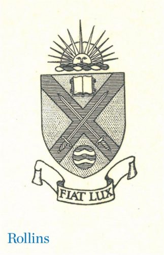
The Rollins Coat of Arms, adopted in 1933, carries a blue St. Andrew’s cross on a gold shield. In addition to the college motto in Latin, it also incorporates the key elements of a rising sun and cascading water below from the College Seal. The two swords emblazoned on the cross were taken from the Coat of Arms of the family of Alonzo Rollins (1832-1887), the initial donor of the College. The book above the cross is a symbol of knowledge, and the emblem below designates a natural spring as a representation of Ponce de Leon’s famous Fountain of Youth. According to Ralph Adams Cram, “These devices together mean that the true fount of youth is knowledge, and that with these two swords, the spirit of youth and the spirit of knowledge, used in the service of the cross, man may hope to attain a real culture which can cope with the evil and ignorance of the world.”[9]
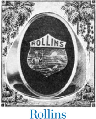
Beside the coat of arms, Rollins also has an official ring, which was first introduced in 1924, following the recommendation of the Class of 1923. As noted by The Alumni Record:
“At the last annual meeting of the Alumni Association the ring outlined above was, upon recommendation of the Class of ’23, unanimously adopted as the standard ring for degree graduates of Rollins College. This design was studied for several months prior to its adoption and represents, according to the Class of ’23, its sponsors, those characteristics which should exemplify Rollins. From the college seal has been taken the rising sun so that ‘Fiat Lux’ is implied if not given in words. The figure of Neptune was chosen to represent the supremacy of Rollins in water sports and the figure of the swimmer was inserted to further carry out the idea of aquatic traditions. The relationships to the word Tar are therefore implied. The rings are 14 karat and come finished in green gold. The background for the crest is onyx. The price is $12.65 [$189.05 in 2019] and orders may be placed through the Alumni Association only, in order to safeguard the design and to eliminate the possibility of ineligibles wearing this handsome ring.”[10]
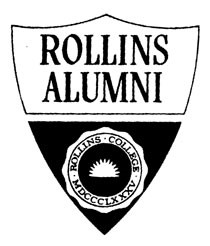
Over the years different units of the College, such as the Crummer Graduate School of Business and the Hamilton Holt School, have developed their own logos in the course of normal business operations, and many departments at the College have also used special visual symbols to enhance public communication. For example, this attractive emblem was developed by the Alumni Office.
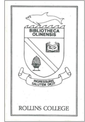
The Olin Library logo is one of the departmental symbols worthy of special note. Dedicated in 1985, Olin Library is the centennial gift of the College. Its logo includes the Latin phrases Bibliotheca Olinesis and Ingressuris Salutem Dicit (“We welcome those who enter”). According to James Gamble Rogers II (1901-1990), architect of the Olin Library, the dolphin was chosen to decorate the building because of its graceful shape. Moreover, it was regarded as a symbol of wisdom and intelligence, and it is also associated with Aldus Manutius (1449-1515), an early printer and publisher who invented italics. As noted by the Library Handbook: “The carved wooden pineapples that decorate the newel posts of the main stairway balustrade of the Olin Library are symbolic of WELCOME. We welcome you to this beautiful library and to the collections it houses. The Library Director, Faculty and staff are committed to assisting you in every possible way to begin your lifetime learning here at Rollins in your Olin Library.”[11]
Fox and Tars
The fox is another well-known and loved symbol at Rollins. Reynard the Fox first appeared in popular satire literature in Medieval Europe.[12] The astute character’s affiliation with the College can be traced back to the Holt era as well. In 1934, at the request of President Holt, Senator Murray Sams donated a pair of statues – a fox and a cat – that used to stand in front of his house in New Smyrna Beach, Florida. Later on at Rollins, these figurines were displayed on pedestals by the walkway of the Recreation Hall (the current location of the Alfond Swimming Pool). Inspired by the two sculptures, Holt founded the Order of the Cat and the Order of the Fox. Lasting until the 1944-45 academic year, these honor societies were exclusive groups composed of only four women and four men each, who were elected by the opposite sex in an annual vote of the student body: the women were elected as the cats; the men were elected as the foxes. From time to time, the fox and cat were taken and hidden as practical jokes; however, by the late 1940s, the cat statue was destroyed by pranksters. As a result, the fox was stored away for safekeeping by the administration and appeared only on annual college holidays. Then in 1956, at the requests of students who wanted “to do something as a college,” President Hugh McKean (1908-1995) launched the Fox Day tradition at Rollins, which is of course still in place today. According to his recollection: “One day in the spring of 1956, I put the Fox out on the Horseshoe, cancelled all classes, and invited everyone to spend the day ‘doing things as a college.’ At the end of the day, many students had a new and warm feeling for their college. That is why and how Fox Day began.”[13]

The term “Tar” is a traditional nickname for British sailors. Before 1917, the Rollins athletic teams were simply known as the “Blue and Gold.” The word “Tar” was first mentioned in the Rollins Sandspur in 1917 when William G. McAdoo (1863-1941), then Secretary of the U.S. Treasury, promoted the liberty loan “for the purpose of equipping with arms, clothing and food our gallant soldiers who have been called for the field; maintaining our Navy and our valiant tars upon the high seas.”[14] It turned out that the United States was ill-prepared for World War I especially in terms of troops; due to the draft, only ten men were left at Rollins in wartime. When a naval training vessel was stationed in Lake Virginia, it was said that the co-eds were attracted to the naval trainees, called Tars.[15] Since then, although no official announcement was declared, all Rollins sport teams have been referred to as Tars.
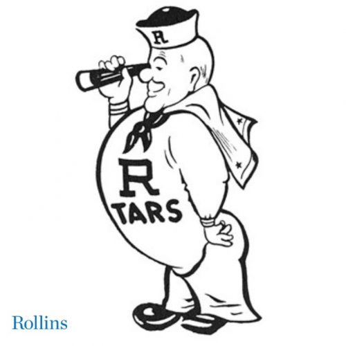
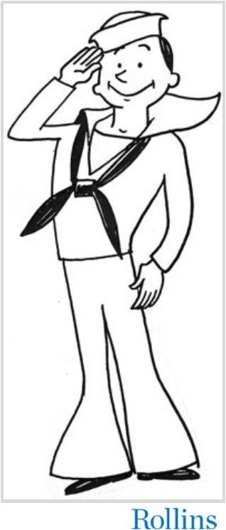
Even though the Tar became the college mascot early on, for a number of years there was no visualization of the fighting sailor by Lake Virginia, although the sport sections of the student newspaper were filled with such references. The first official image of the Rollins Tar appeared in 1948, when Wanita Mutispaugh ’35, who had studied art under Hugh McKean, submitted a sailor emblem as a possible Rollins symbol.[16] Then in 1965, in an attempt “to match the youth and vigor of the new Tar,” Rollins trimmed a few pounds off his frame, and added a brisk, youthful appearance to the once-aging sailor. When the alumni re-introduced the Tar with their annual fund appeal, it was noted that “our versatile Tar, ever responsive to the needs and accomplishments of the college which nurtured him, saw fit to salute the sons and daughters of Rollins for their accomplishments, and for their vigorous new fund program.”[17]
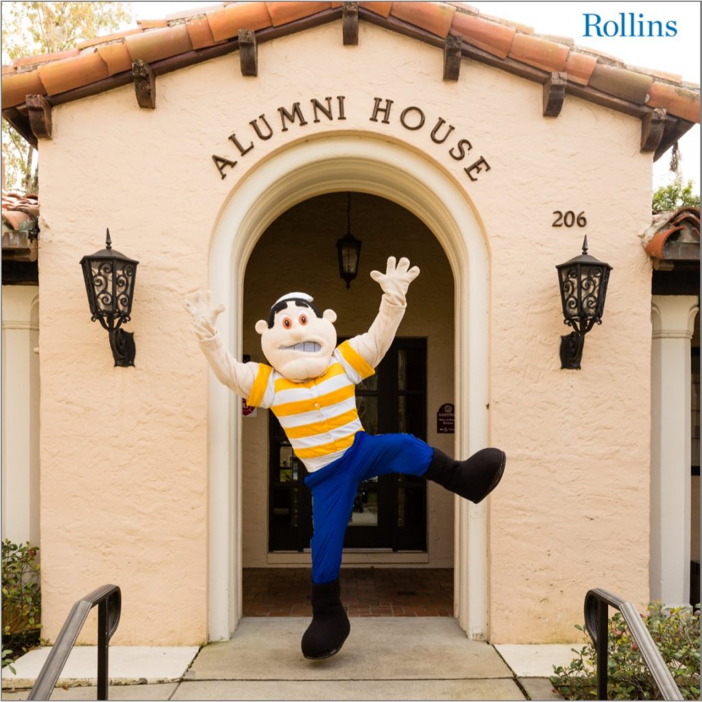
There have been some controversies associated with the Tar as Rollins’ mascot in recent years. In 1992, The Sandspur led a failed effort to trash the Tar, which the newspaper claimed “was a symbol of our past, of days when war ravaged the world . . . But today, the Tar has become irrelevant within the context of our society . . . A mascot should invoke a familiar image that represents strength, agility, determination, and cunning. A Tar is none of these.”[18] A couple of years later, the SGA commissioned another committee to re-evaluate the Tar as the mascot of the College, since many students were not aware of its obscure origins, while others objected to its military connection.[19] Instead, the fox was proposed as the new college mascot. Nonetheless, after student athletes launched a petition to voice their objections to the new proposal, the Tar icon weathered the storm and remained a college symbol. Finally in 2005, the Rollins Tar received a new personification in the form of “Tommy the Tar,” a costumed mascot who since has become a favorite with students at athletic and other campus events.[20]
Anchor R and Block R
Entering the new millennium, use of the Tar as college mascot is still questioned by members of the Rollins community. Noting there is no such thing as a “Lady Tar,” a female student argued, “it is time for the Rollins College mascot to reflect the diversity of our community.”[21] After Lewis Duncan became the fourteenth president of the College, a major re-branding campaign was launched in 2008, and Dean Steve Neilson was charged to lead a committee to re-examine and explore a comprehensive transformation of Rollins mascot. However, after seeking input from students, faculty, staff, and alumni, Tommy the Tar survived another round of identity crisis. With the help of a collegiate athletic branding agency, the Tar re-emerged strong on campus with a new appearance that featured a resolute sailor in Rollins Gold and Blue, firmly holding an anchor in his hand.
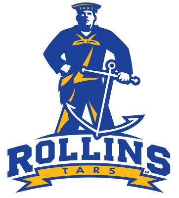
This is the first time that an anchor was featured in the Rollins logo. But since its introduction more than ten years ago, this icon has become popular around campus. From “Drop A Line,” “Anchor Down,” and “Anchors Away,” to “Find Your Anchor,” and “Be the Anchor” – slogans started by Student Affairs – Anchor R has become one of most recognizable symbols at the College today. Not only is it built into the floor of the McKean Gym and student workout facilities, it is also a popular merchandise gift.
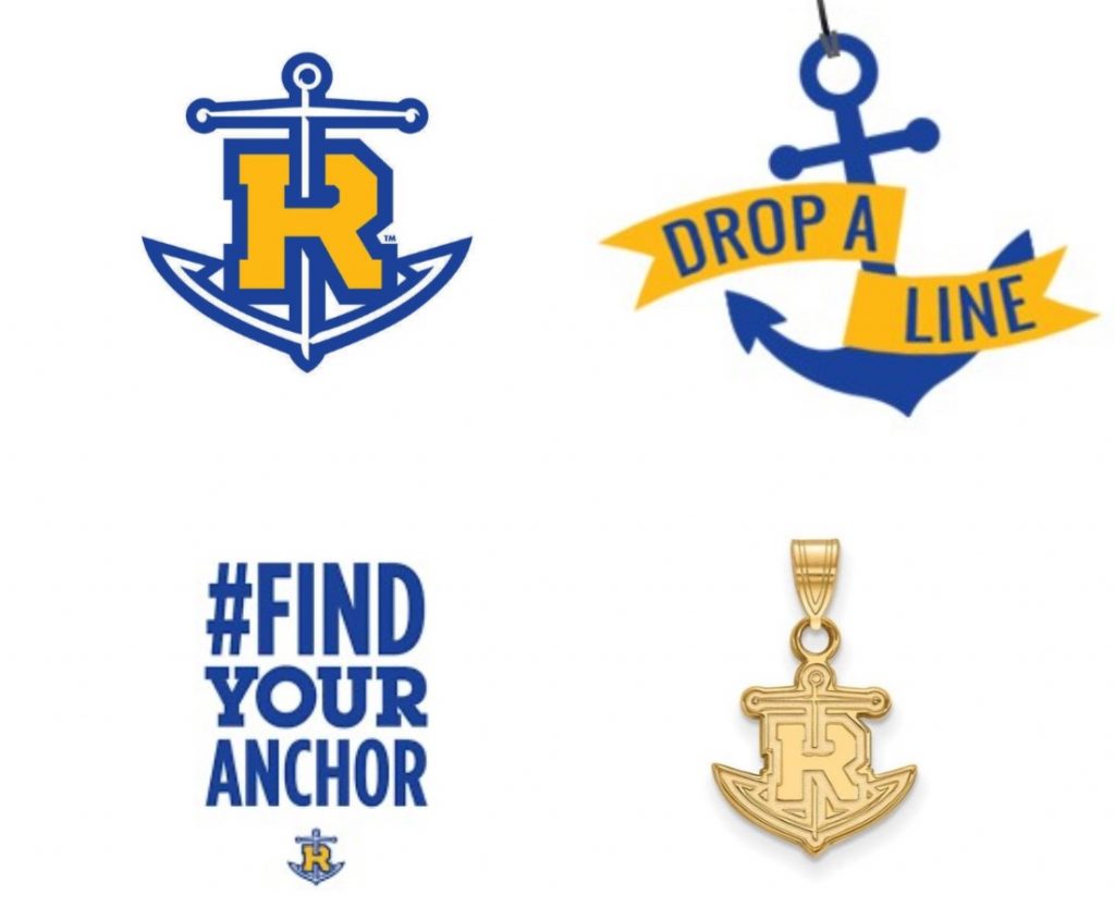
More recently, as part of a major initiative to rebrand Rollins as a more prestigious college, the Office of Marketing and Communications has launched new efforts in streamlining brand use at Rollins. The Rollins College Brand Guide was created in 2014 and updated in 2018, and lists all the official color schemes, logos, fonts, formatting specifications, and titling guidelines that are recommended for marketing the College and/or its particular units in print or online. In the case of the athletic logo, initially it was recommended that the anchor be “dropped” to present a simple R in Rollins’ classic colors, gold and blue. According to Sam Stark ’91, Vice President of Communications and External Relations at Rollins, there is a concern that there are multiple symbols within the Anchor R: “The anchor is bigger than the R and slashes through it. There shouldn’t be a two-sided story to branding. It needs balance.”[22] Since the anchor raised many questions as to its meaning, and most people unfamiliar with the College have no institutional knowledge of Tars or Tommy the Tar, it is believed that the anchor interferes with or obscures Rollins’ branding message.
However, this measure to “drop the anchor” from the logo has generated new controversies on campus. The “R” with the anchor has already been fully embraced by current students and recent graduates, notwithstanding its short lifespan. When the proposed plan was made public in Spring 2018, student in particular began to voice their opposition. One student questioned: “That is something that we identify with. Why is it being stripped away?”[23] Another passionately argued: “The anchor has come to symbolize an important part of my development here at Rollins and embodies much of what I think makes Rollins great.”[24] To generate support from the wider community, a student athlete also launched an online petition through www.change.org that generated nearly 700 signatures in three months.[25] In the end, after a thorough review, it became clear that there is a strong loyalty to the anchor symbol among members of the Rollins community. Therefore, as part of the new Brand Guidelines and notwithstanding some design issues, the Anchor R remains an important college symbol reserved only for the Athletics and Student Affairs, while all other campus groups are invited to use the Block R in its place. Finally in summer 2018, after careful planning, a redesigned college logo was unveiled, which is clean, clear and balanced, designed to better reflect a modern, bold institution while highlighting Rollins’ history and academic prowess.
In this day and age, branding has become a very important marketing and communication instrument that helps to distinguish an institution and its services from all its rivals. Throughout the College’s history, logos and other symbols have been used as effective tools for generating emotional stories and reinforcing the collective experiences of our thriving community of learners. In the twenty-first century, it seems that less is more. Today’s principle in logo design is to keep things simple and clean, as modernist-inspired logos have been proven successful in the era of mass visual communication and digital innovations. “Given this dynamic environment, it is increasingly important for us to express a single, compelling voice in everything we do.”[26] With our renewed efforts of educating students for global citizenship and responsible leadership, it is imperative for the college community to act and communicate as ONE ROLLINS. Regardless of the outcome of the current debate about the future of the college logo, it is clear that Rollins’ brand will grow stronger and positively influence how people see and think about the College.

The author is grateful for the reviews and recommendations made by Prof. Jack Lane, Rachel Walton, Mr. Sam Stark and Mrs. Darla Moore.
[1] Lorrie Kyle Ramey, “Rollins Trivia: A Rollins Perspective Part I,” Rollins Magazine, Fall 2009, https://www.rollins.edu/magazine/archive/fall2009/stories/rollins-perspective-trivia.html.
[2] Marjorie Blackman Sloatermen, “Brebbie, Miss Grace Lainhart and Art,” Summer 1966, 45E Faculty Files, Rollins College Archives, Winter Park, Florida.
[3] Office of Marketing & Communications, Rollins Brand Guidelines (Winter Park, FL: Rollins College, 2018), https://www.rollins.edu/marketing-communications/documents/rollins-brand-guide.pdf.
[4] Darla Moore, “The First College Color: Oleander Pink,” From the Rollins Archives, October 30, 2013, https://bit.ly/37kTVWH.
[5] “The College Color,” Rollins Sandspur, December 20, 1894, pp. 14-15, http://digital.library.ucf.edu/cdm/ref/collection/CFM/id/9634.
[6] Ibid.
[7] Darla Moore, “The First College Color: Oleander Pink,” From the Rollins Archives, October 30, 2013, https://bit.ly/37kTVWH .
[8] Minutes of Faculty Meeting, 45A Faculty Bylaws & Minutes, Rollins College Archives, Winter Park, Florida.
[9] Lorrie Kyle Ramey, “Rollins Trivia: A Rollins Perspective Part II,” Rollins Magazine, Spring 2010, https://www.rollins.edu/magazine/stories/historical-trivia.html.
[10] “The Standard Rollins Ring,” Rollins Alumni Record, February 1924,
https://scholarship.rollins.edu/magazine/35.
[11] Olin Library Handbook: A New Century of Service in the New Olin Library (Winter Park, FL: Rollins College, 1985), 2.
[12] Darla Moore, “How the Fox Came to Rollins,” From the Rollins Archives, March 22, 2012, http://blogs.rollins.edu/libraryarchives/2012/03/22/how-the-fox-came-to-rollins/.
[13] Hugh McKean and Evelyn Draper, The First Fox Days, 1956-1969 (Winter Park, FL: Friends of Fox, 1987), https://scholarship.rollins.edu/cgi/viewcontent.cgi?article=1011&context=archv_books.
[14] William G. McAdoo, “The Liberty Loan,” Rollins Sandspur, October 6, 1917, http://digital.library.ucf.edu/cdm/ref/collection/CFM/id/23556.
[15] Bobby Davis, “What’s a Tar?!” Rollins Magazine, Fall 2015, https://www.rollins.edu/magazine/archive/fall2009/stories/whats-a-tar.html.
[16] Ibid.
[17] “The Rollins Tar,” Rollins Digital Collections, https://www.jstor.org/stable/community.38482054.
[18] “Trash the Tar,” Sandspur, September 9, 1992, http://digital.library.ucf.edu/cdm/ref/collection/CFM/id/165734.
[19] Kim Hanisak, “Tars: To Be or Not To Be,” Sandspur, November 17, 1994, http://digital.library.ucf.edu/cdm/ref/collection/CFM/id/166660.
[20] Bobby Davis, “What’s a Tar?”
[21] Susan Williams, “Calling All Lady Tars!” Sandspur, October 31, 2003, http://digital.library.ucf.edu/cdm/ref/collection/CFM/id/168684.
[22] Ellie Rushing, “Student Athletes Fight to Keep Anchor-R logo,” Sandspur, April 19, 2018, http://www.thesandspur.org/student-athletes-fight-keep-anchor-r-logo/.
[23] Ibid.
[24] Paul Schattschneider, “Logo change undermines campus identity,” Sandspur, April 19, 2018, http://www.thesandspur.org/opinion-logo-change-undermines-campus-identity/.
[25] “Keep the Rollins logo as is,” Change.org, 2018, https://www.change.org/p/rollins-college-president-grant-cornwell-keep-the-rollins-logo-as-is.
[26] Office of Marketing & Communications, Rollins Brand Guidelines 2018 (Winter Park, FL: Rollins College, 2018), https://www.rollins.edu/marketing-communications/documents/rollins-brand-guide.pdf.
