The very first post in this series went live on April 1, 2020, amidst the first waves of shutdowns (including of CFAM) due to the COVID-19 pandemic. Since then, a great deal has changed, both at the museum and in the wider world. As I wrote that first entry, I was unsure if I’d even get to finish the project. In part that fear was for practical reasons—the library at Virginia Tech, which I have relied on for so much of my research materials over the last year and a half, also shut down last spring. But it was also more existential than that, since none of us really knew what was to come. This blog was in part a response to that uncertainty. Sharing my research with the museum’s audience was always a part of the plan, but it seemed to take on new urgency as the world shut down. Plus, it was something I could do from home, using research I’d already completed. That’s why the first entries are so focused on eighteenth and nineteenth century art; it’s what I had available to work on. As the world (and its libraries) opened back up, so did my research, and you can track that process in the blog. And now, over a year after I first started writing it, I’m coming to the end of my research project.
When this goes live, I’ll be fully vaccinated against COVID-19, which seems like a miracle given how recently the disease emerged. The pandemic isn’t over, of course, but at the same time the broad availability of the vaccines gives me hope for the future. That excitement, however, is tinged with a bittersweet feeling. That’s because my term as the American Art Research Fellow is coming to an end. Aside from a few odds and ends here and there, I am finished with my part of the Luce Foundation-funded project. I have researched over two hundred artists, and several times that many individual works of art, over the last year and a half. All that’s left is a series of reports, summaries, and other wrap-ups. This is important work, and I’m excited to do it, but it’s also not exactly the stuff of an interesting blog post. For that reason, I’ve decided that this is a good time to wrap up this series.
One of the absolutely wonderful things about museum work is how public facing it is, and these posts have allowed me to maintain that connection to all of you, our friends and members, despite everything that’s happened this year. I hope you’ve enjoyed reading them as much as I’ve enjoyed writing them. Though this series is ending, there are a few more opportunities for you to hear from me over the next year or so. On June 8 I’ll be giving a talk via the museum’s Facebook Live feed, sharing the fruits of my research. You might recognize some of the insights I’ve shared with you here, woven into a broader story of the collection. Later this year, on September 18, my exhibition American Modernisms at the Cornell Fine Arts Museum will open. It will examine the American modern artists who have been such a key part of this blog as well as my broader research, highlighting the ways in which our collection here at CFAM can participate in some of the most important debates and currents in the story of American art as it’s understood today. There will be additional lectures and other events associated with that, so stay tuned.

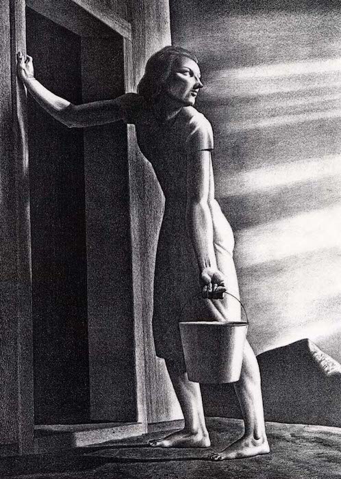
16 in. x 12 in., Gift of Mrs. Ruth Funk, 2001.4.8. © Estate of Rockwell Kent, Plattsburgh State Art Museum
Because it wouldn’t feel right to end this blog post without talking about an image (what kind of art historian would I be if I could even try?), I’d like to leave you with this work, Goodbye Day by the American painter and illustrator Rockwell Kent. Kent is perhaps best remembered today for illustrating a 1930 version of Herman Melville’s Moby-Dick, or The Whale 1. Goodbye Day, from sixteen years later, is another wonderful example of Kent’s mastery of the contrast between light and dark. Executed in collaboration with the renowned lithographer George Miller, Kent seems to have preferred the title The Water Carrier, which makes sense given his leftist politics and the stoic weariness that characterizes the print’s lone woman.2 The setting is bleak—a bare mountain and hard ground—and the harsh light of sunset bathes the woman’s equally harsh features. She leans wearily on the jamb of a simple wooden door, about to disappear with her burden into forbidding darkness. Yet there is also a sense of hope, or at least of solid resilience, in the square set of her muscular legs and broad shoulders. It’s an evocative, mysterious image, one which leaves open the possibilities of strength and defiance even as it acknowledges pain and toil. It’s also a key part of the story of American modernism, and I hope you’ll come see it as part of American Modernisms at the Cornell Fine Arts Museum.
1 If you haven’t read the book but have always meant to, make sure it’s that version you pick up when you do. Kent’s angular, modern renderings add so much to what is already, by my reckoning, the greatest novel in the history of American literature.
2 Dan Burne Jones, Rockwell Kent, and Robert Rightmire, The Prints of Rockwell Kent: A Catalogue Raisonné, Rev. ed (San Francisco, Calif: Alan Wofsy Fine Arts, 2002), 276.

