
Back in September, I wrote about the affinities between Joseph Cornell and Earl Cunningham, two untrained eccentrics who made collecting the core of their artistic practices. In that post I also wrote about the serendipity of research, whereby the proximity of the artists’ last names helped me to draw a connection between their art. This week I have made a similar discovery, though it was not alphabetical but rather temporal. Two prints in the collection—Untitled (Derby Hat) by Cornell and Spinning Faces in Space by James Rosenquist—happen to have been made in 1972. As with Cornell and Cunningham, that serendipitous proximity might seem to be all the works have in common. After all, Derby Hat is a mostly monotone assembly of printed material rendered in the old-fashioned medium of heliogravure. Spinning Faces in Space, on the other hand, is brightly colored, executed in a mix of lithography and serigraphy (better known as silkscreen printing), the latter of which is the quintessential twentieth century printmaking medium. Yet the two works—and their artists—do have quite a bit in common, and the way in which they do speaks to the fascinating and often oblique ways ideas and techniques are transmitted from one artistic generation to another.
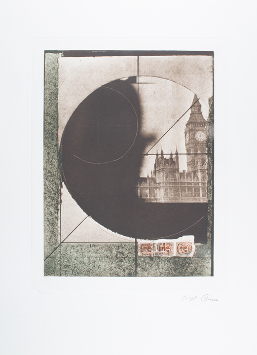
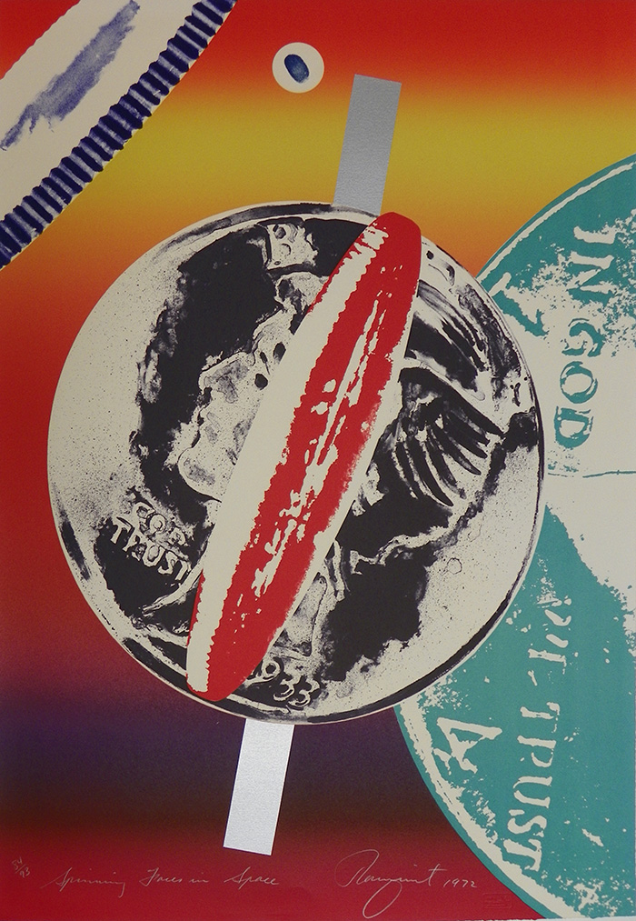
13 ¼ in x 10 ¼ in. Print, Purchased by the Wally Findlay Acquisitions Fund. 1993.3. © The Joseph and Robert Cornell Memorial Foundation/ Artists Rights Society (ARS), New York, NY Right: James Rosenquist, (American, 1933-2017), Spinning Faces in Space, 1972, Multicolor lithograph and screenprint on Arches Cover, 33 in. x 23 ¼ in.
Gift of Mr. and Mrs. Robert L. Gardner, New York, NY, 1982.14.3. © Estate of James Rosenquist / Artists Rights Society (ARS) New York, NY
Rosenquist, who was thirty years Cornell’s junior, worked as a billboard painter while in college at the University of Minnesota as well as during the early period after he moved to New York in 1955. This familiarity with commercial art, in particular the grid systems that allow artists to translate small source images to large billboards while maintaining legibility, helped Rosenquist to develop an artistic style that incorporated the visual languages of advertising and popular magazines. He began to make these works during the early 1960s, coincidentally during the exact moment that Andy Warhol, Roy Lichtenstein, and other artists were making a similar move in their art. This caused the three of them, along with a number of those others, to achieve near-instantaneous renown as the harbingers of a new era, known as Pop.1 Though the various artists under that umbrella indeed shared a common interest in commercial techniques and imagery, they also all developed unique styles and approaches. For Rosenquist, a key aspect of his approach was the use of collage. Specifically, he kept a huge archive of found material—mostly images from advertisements and photo essays in Life magazine—which he used to create collages that formed the basis of his paintings and prints.2
Cornell’s interest in collage, as I wrote in my previous post, as well as his interest in the dreamy world of the subconscious, aligned him with the Surrealists, who were his contemporaries. When Rosenquist first came to prominence he, too, was often compared to the Surrealists, especially before he was wrapped up in the larger Pop phenomenon.3 Rosenquist was the only one of the Pop artists to make extensive use of collage, so this connection seems natural.4 It is even more natural when considering that Rosenquist explicitly sought out these connections, befriending a variety of Surrealist artists during his early days in the city. One of these artists was Cornell himself, who invited Rosenquist to come to his Queens home—which Cornell termed his “habitat”—on several occasions. Indeed, it was Cornell’s habitat and archive full of ephemeral material that inspired Rosenquist to make a similar collection in his Manhattan studio.5
With this background in mind, the affinities between the two prints snap into sharper relief. Both collect and layer a variety of found imagery, and both are dominated by central round forms. Cornell’s use of stamps seems to anticipate Rosenquist’s currency. Both images also have a fuzzy quality that speaks, perhaps, to the optical effect of repeated reproduction or abrupt changes in scale. Then again, there are differences, too. There is the aforementioned color—Rosenquist’s is so bright, so evocative of Pop, while Cornell’s is muted and gray. Cornell’s image is also possessed of a fundamental stillness rooted, perhaps, in its old-timey subject matter and careful geometry. As its title indicates, meanwhile, Spinning Faces in Space is as dynamic as Derby Hat is static. Driven by different life experiences and interests, the two artists have created works that are as different as they are similar. Ultimately, whatever their formal relationship, the two prints are bound by the two men’s friendship, as well as their shared practice of methodical collecting.
1 Michael Lobel and James Rosenquist, James Rosenquist: Pop Art, Politics, and History in the 1960s (Berkeley, Calif.; London: University of California Press, 2010), 9. Constance W. Glenn and James Rosenquist, Time Dust, James Rosenquist: Complete Graphics, 1962-1992 (New York: Rizzoli, 1993), 1.
2 Glenn and Rosenquist, Time Dust, James Rosenquist, 14–22.
3 James Rosenquist et al., eds., James Rosenquist: A Retrospective (New York, New York: Guggenheim Museum, 2003), 9.
4 Rosenquist et al., 19.
5 Rosenquist et al., 25.